PROJECT
Everyone, at a certain point in their life, needed expert help but found themselves unable to get that help. Expert is an application that allows users to connect with mentors or experts in a field of their choice anytime.
Duration: 6 months
Method: Competitive analysis, Interviews, Card sorting, User Stories, User personas, User flows, Sitemap, Usability test, Preference test, Responsive framework.
Tools: Adobe XD, UsabilityHub
PROBLEM
When starting to work on ExperT, some of the potential problems that I thought the users would have had are, "users might not trust the advice from random people that call themselves experts on the internet", "users might have a hard finding an expert out of the multitude of experts available", and "advice given by experts might be too complicated for users depending on their knowledge on the subjects".
GOAL
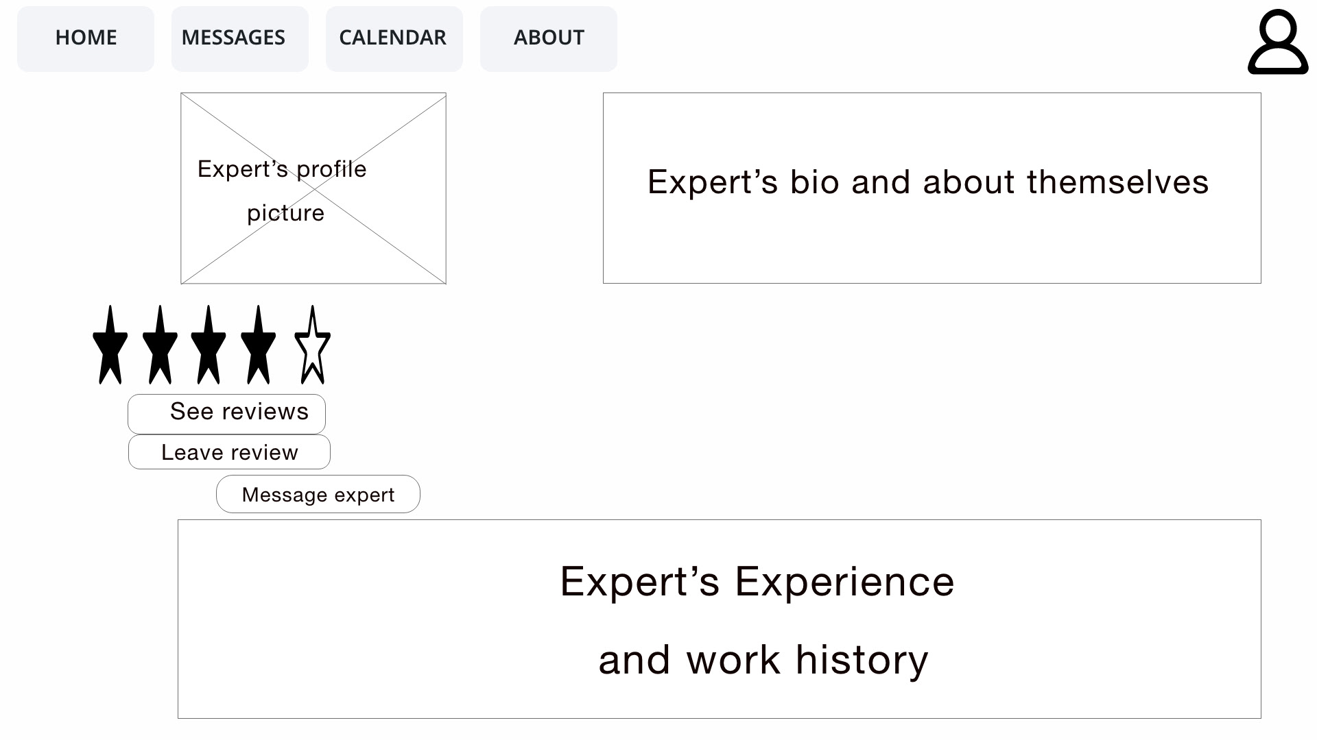
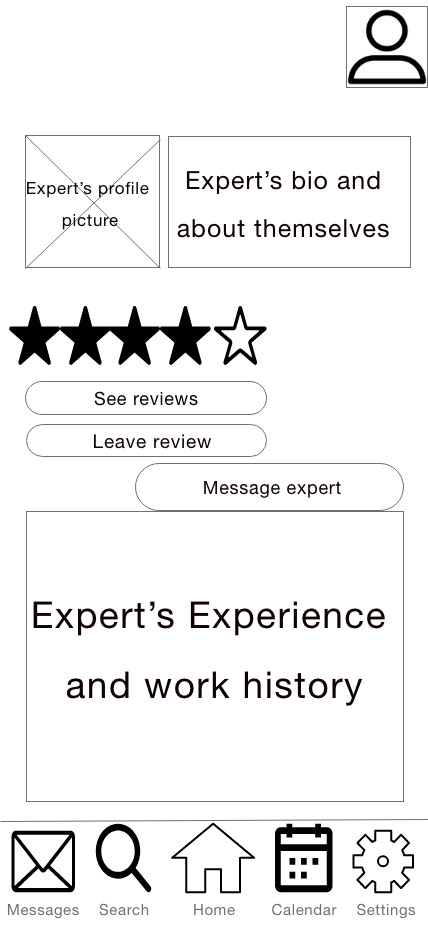
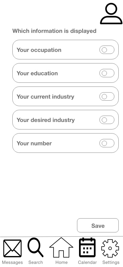
From the potential problems, my vision of the application was one where the experts would be credible sources. Their credibility would be proven by having the experts display their credentials like degrees, certifications, or projects they had done. Another way that the credibility of the experts will be verified will be by allowing the users they have worked with to leave reviews about them, which will help potential users to know how that expert works.
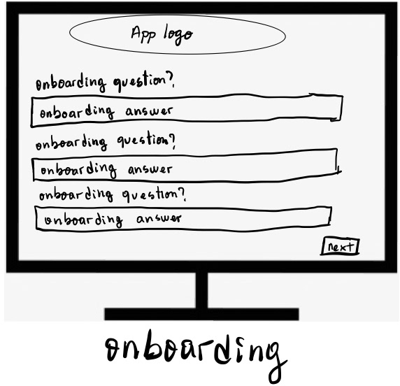
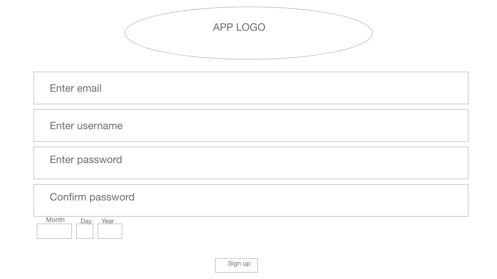
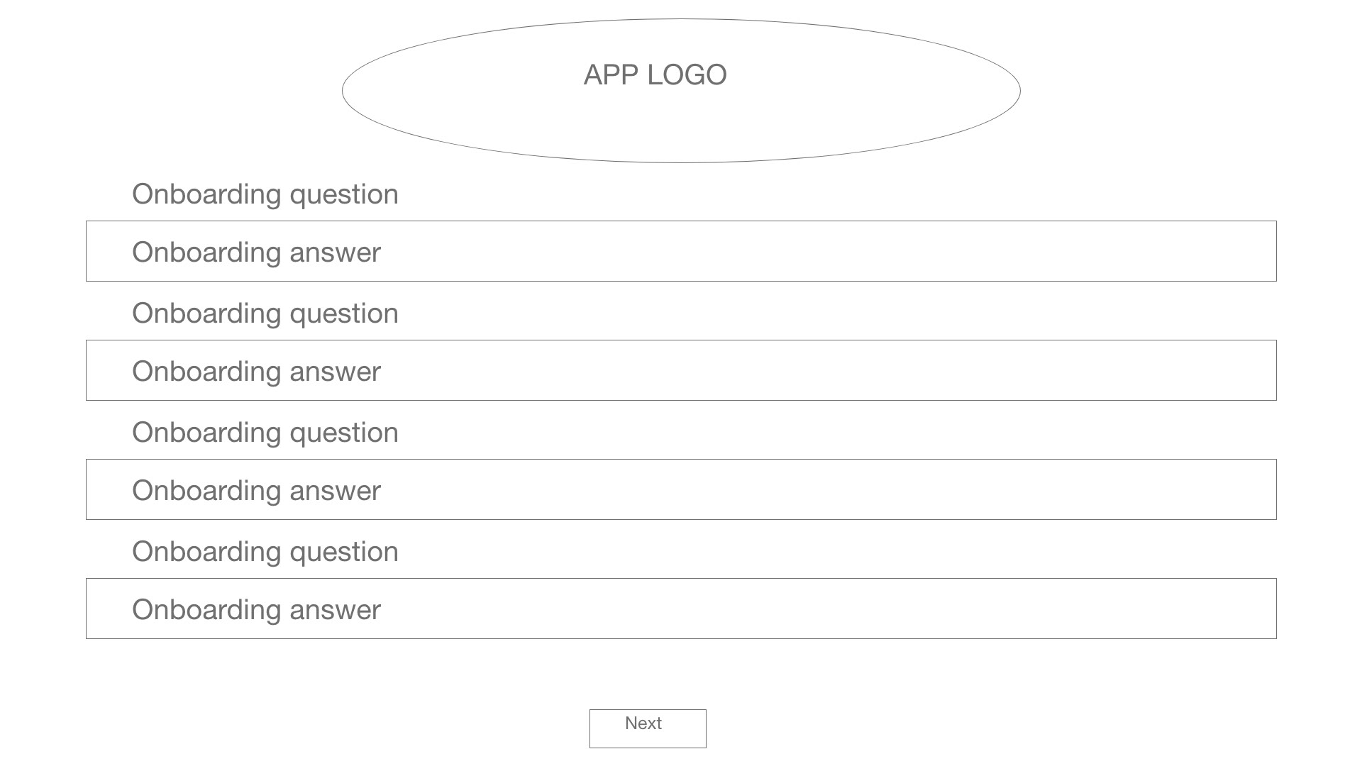
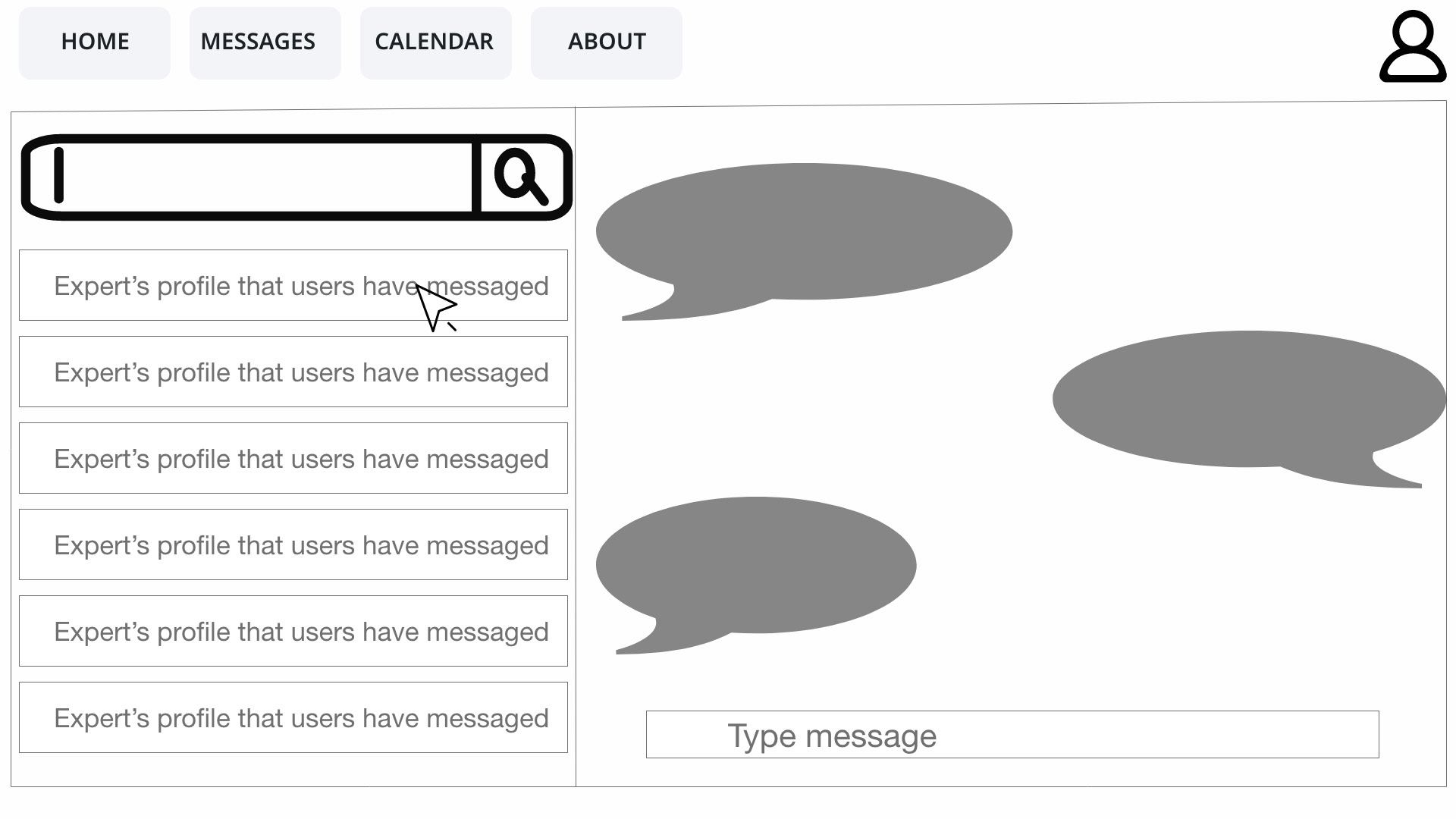
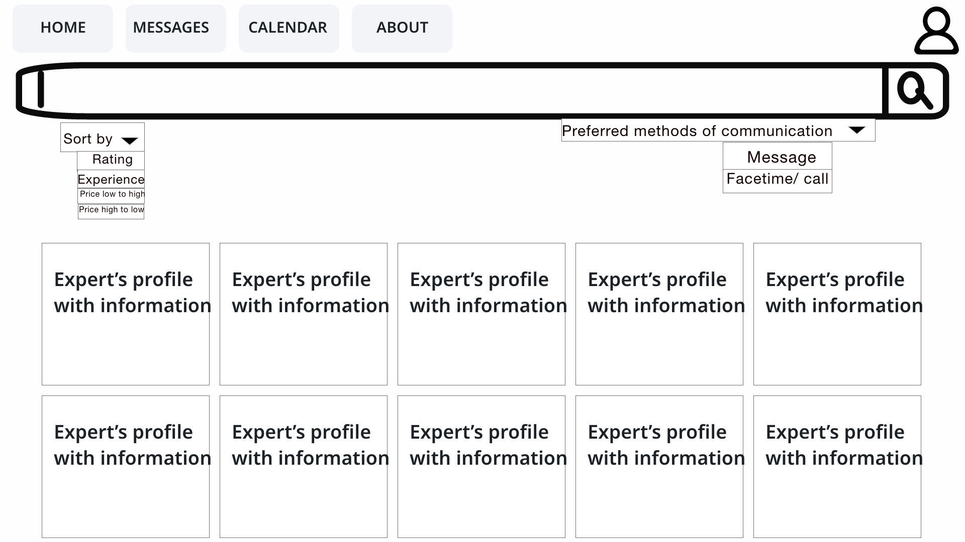
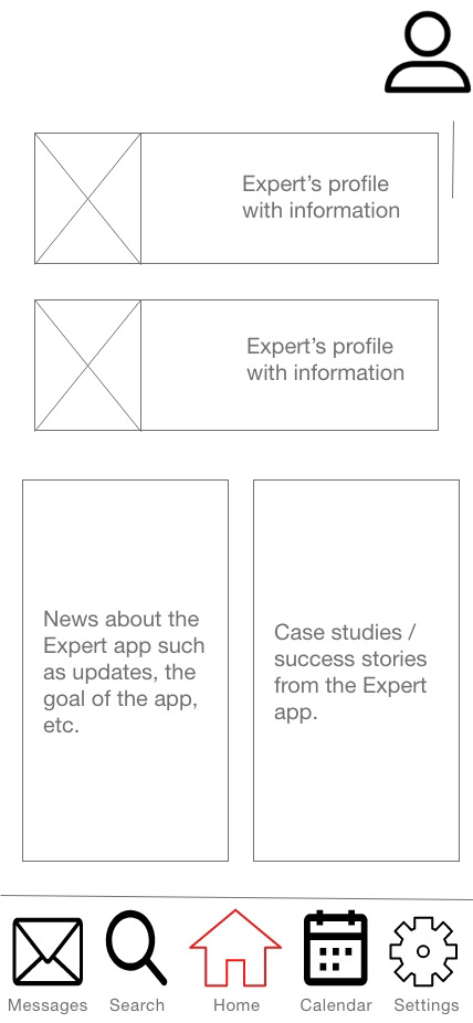
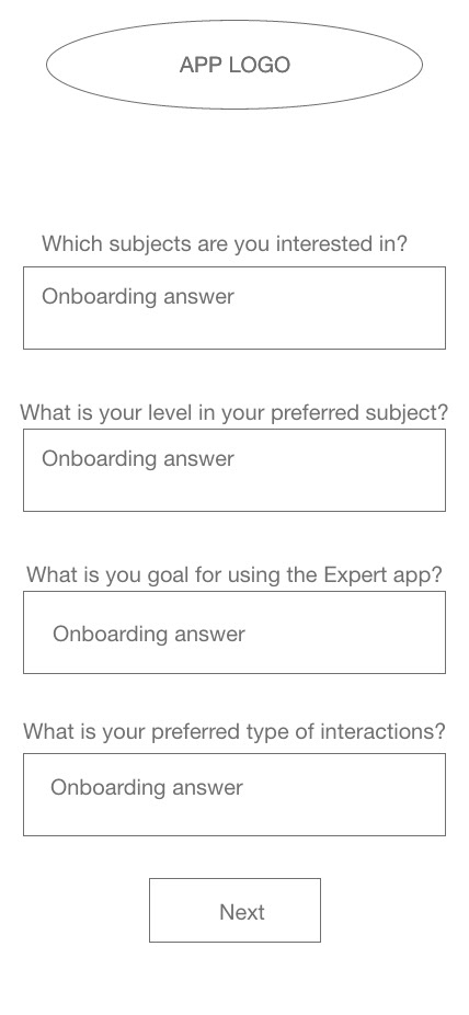
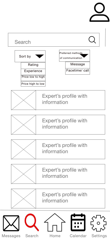
To help the users have an easier time finding the best expert for them, I will make it so that experts can link specific keywords to their accounts which will help the users find specific experts by typing those particular keywords or the name of the said experts. To help users get explanations depending on their level of expertise, they will answer questions during the onboarding process that will tell the application whether they are beginners, intermediates, or advanced in what they are interested in. Later on, the users can change their levels as they progress.
RESEARCH
Competitive Analysis
I decided to conduct a competitive analysis to learn more about what users might be interested in an expert-finding application. The competitive analysis was performed on three platforms: Fiverr, Upwork, and PushFar. A good point that all the platforms had in common is that they could be used without signing up for their services, meaning that users could get a feel for them without making any commitment.
Some strengths of Fiverr are its wide range of experts, the application is easy to use, and it is well-known. Some of its weaknesses are that it is only active in a few countries, Experts do the job for the users, meaning that the users cannot learn how to do that job themselves if they choose to do so, and the credibility of its experts can be faked.
Some of Upwork's strengths are that it has a lot of experts with a wide price range smoothing the users' choice, and it's cheaper than competitors. Some of its weaknesses are it needs to be advertised more, finding experts is not easy and is time-consuming, and users can only pay for the job and not learn from the experts.
Pushfar's strengths are that the platform is free to use and has a wide variety of mentors. Some of its weaknesses are that it is not well known because of poor advertisement, and the platform is confusing and complicated.
Interviews
An interview was conducted to understand what a positive interaction with mentors looks like to our users, the preferred type of mentors' interactions with users, and what users would like from a mentoring application.
The interview was conducted with three participants, aged 20 to 25, two males and one female. The interview questions were:
. What is your occupation?
. What do you like to do for fun?
. What are your career plans?
. Why did you pick that career?
. Looking back, is there anything you wish you knew about your career?
. What do you think is the biggest obstacle to your career?
. What is your definition of a mentor?
. What would a good interaction with a mentor be for you?
. Where did you meet your mentors?
. What are your thoughts on interacting with mentors so far?
. What would you want from a mentor to improve your experience?
. When did you have a bad experience with a mentor? What happened?
. What is the mentoring platform of your choice?
. What would make it easier for you to interact with mentors?
. What is something you would want from a mentoring app?
. Would you like to interact with mentors in the app or outside the app?
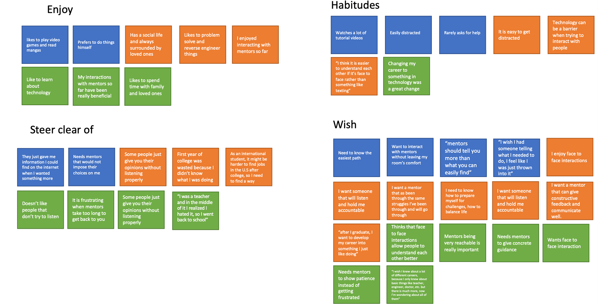
Some quotes from the interview by the participants are:
. I was a teacher and in the middle of it, I realized it was not for me, so I went back to school.
. I wish I knew about a lot of different careers because I only knew about basic things like teachers, engineers, doctors, etc. but there is much more, and now I’m wondering about all of them.
. mentors should tell you more than what you can easily find.
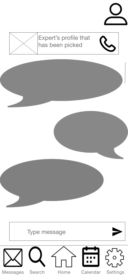
. I think it is easier to understand each other if it’s face-to-face rather than something like texting.
. I wish I had someone telling me what I needed to do, I feel like I was just thrown into it.
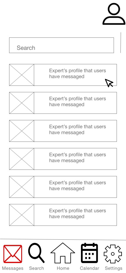
Some of the things that the interviews helped me learn about what users' needs and goals are: Users enjoy face-to-face interactions with mentors, users want to be able to reach mentors quickly, users want to be able to see the mentors' background and history to pick a mentor better, users wish to get a mentor that truly understands them and have been through the same situations as them, users enjoyed interactions with mentors that listened to them and did not force their opinions on them, and users want to be able to interact with mentors outside the app if possible. From the interviews, I also learned what the users enjoy, wish, their habits, and what to avoid. From that information, I was able to create an affinity map.
USER STORIES
. As a new user, I want to be shown everything that the Expert app has to offer, so that can know my best course of action before creating an account.
. As someone that values individuality, I want to be asked for information that may be unique to me, so that I can have a unique experience.
. As a new user, I want to be able to create an account, so that I can start using the application and input my information.
. As an existing user, I want to be able to log in quickly, so that I can readily start using the application.
. As someone who values time, I want to be able to see recommendations of experts after opening the application, so that I can pick an expert quickly.
. As someone that likes efficiency, I want to be able to scroll through the different options available in the application, so that I pick the one that suits me better at that moment.
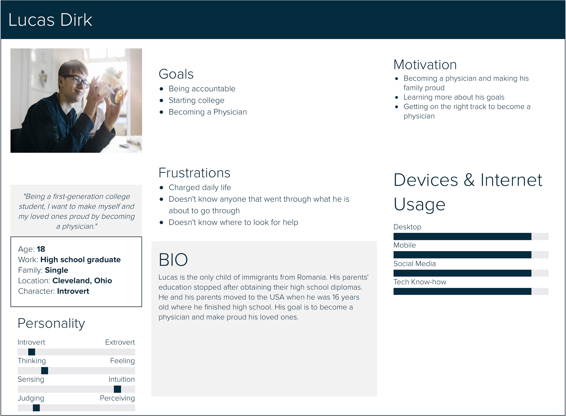
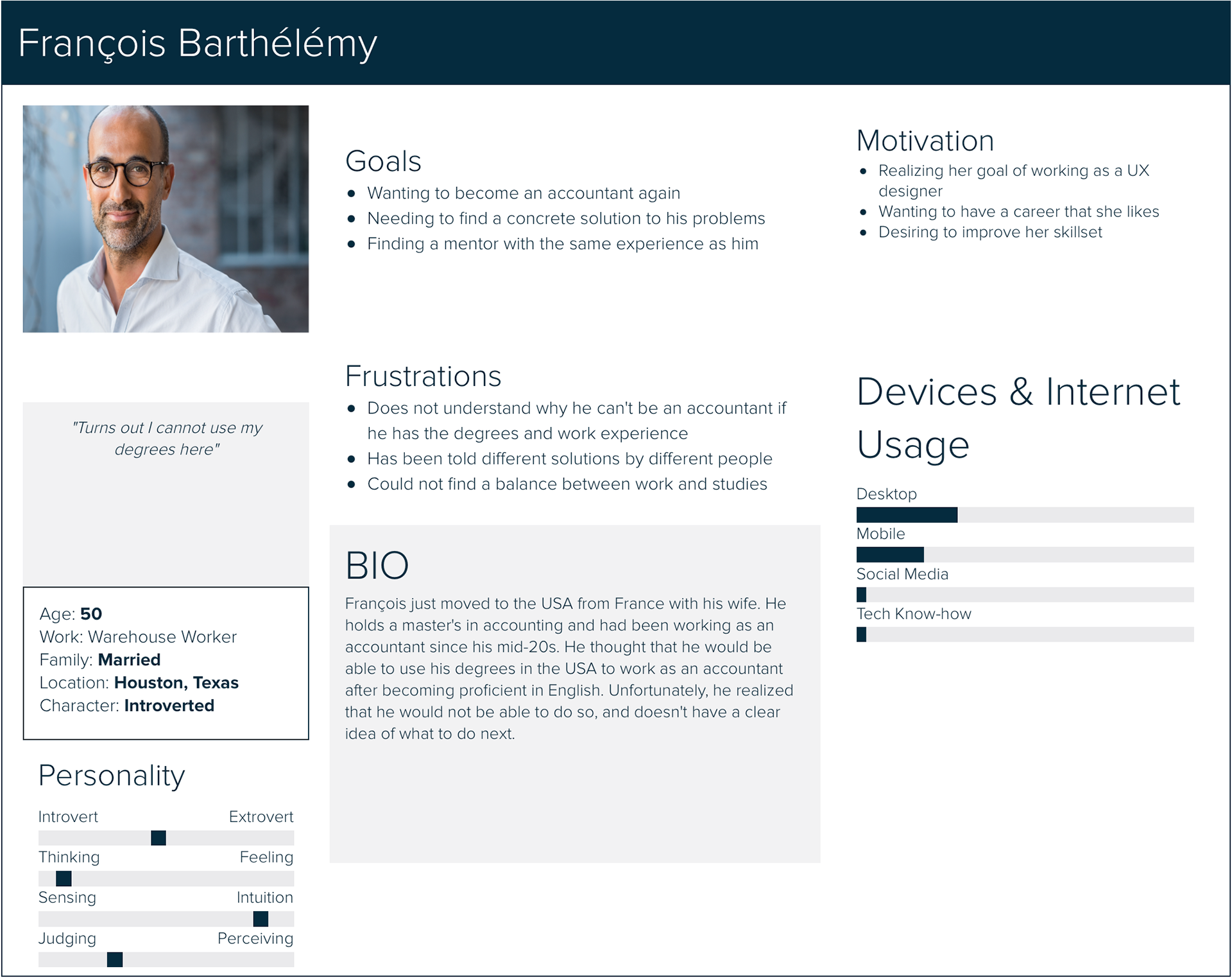
USER PERSONAS
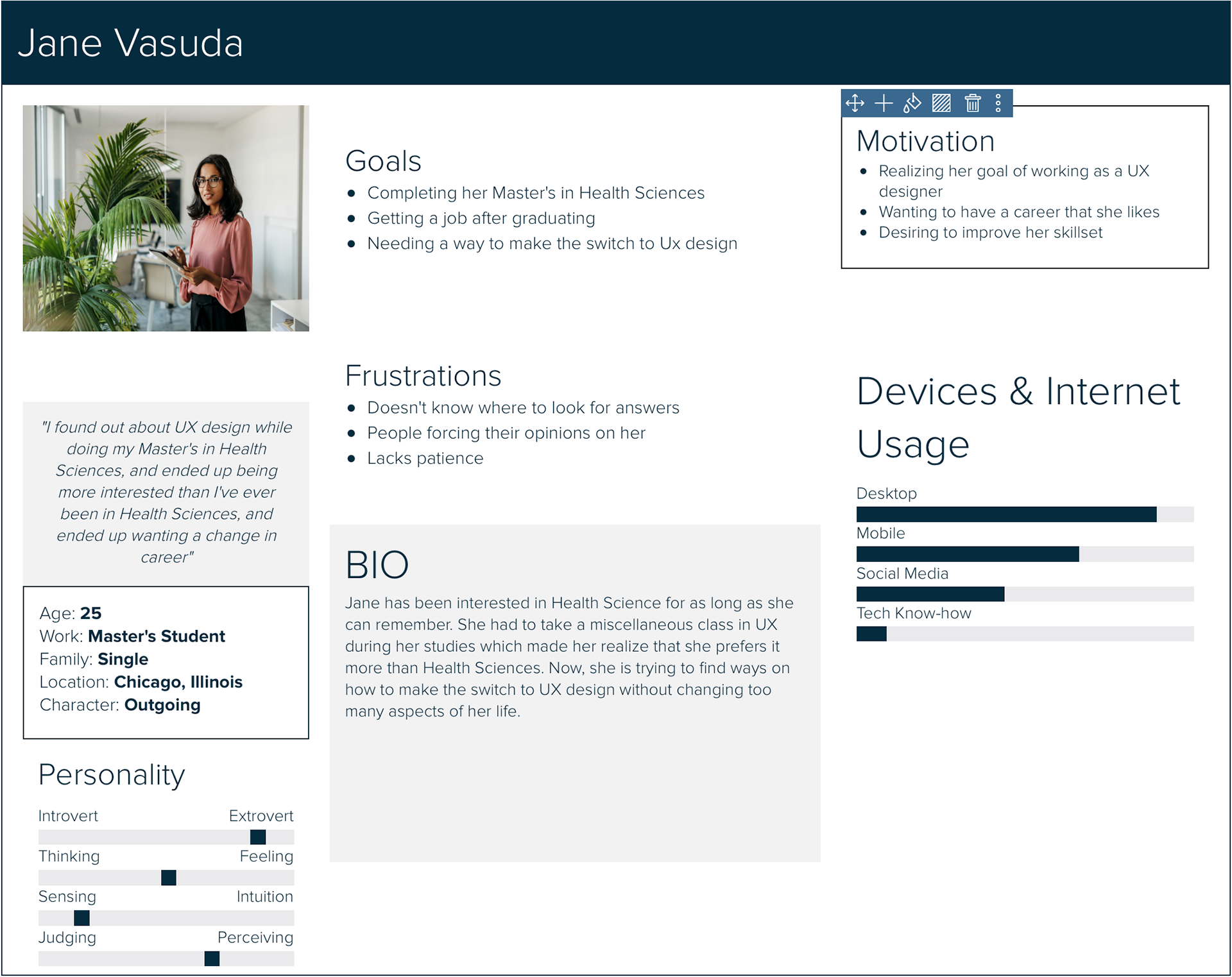
User personas were made to show what my target audience could be. The ExperT app targets everyone needing advice, so three user personas with different demographics and stories were created to show that target audience. But, my primary persona will be Jane Vasuda because the younger or older the users are, the less likely they will seek expert help because they will feel as if they don't need it or know everything already.
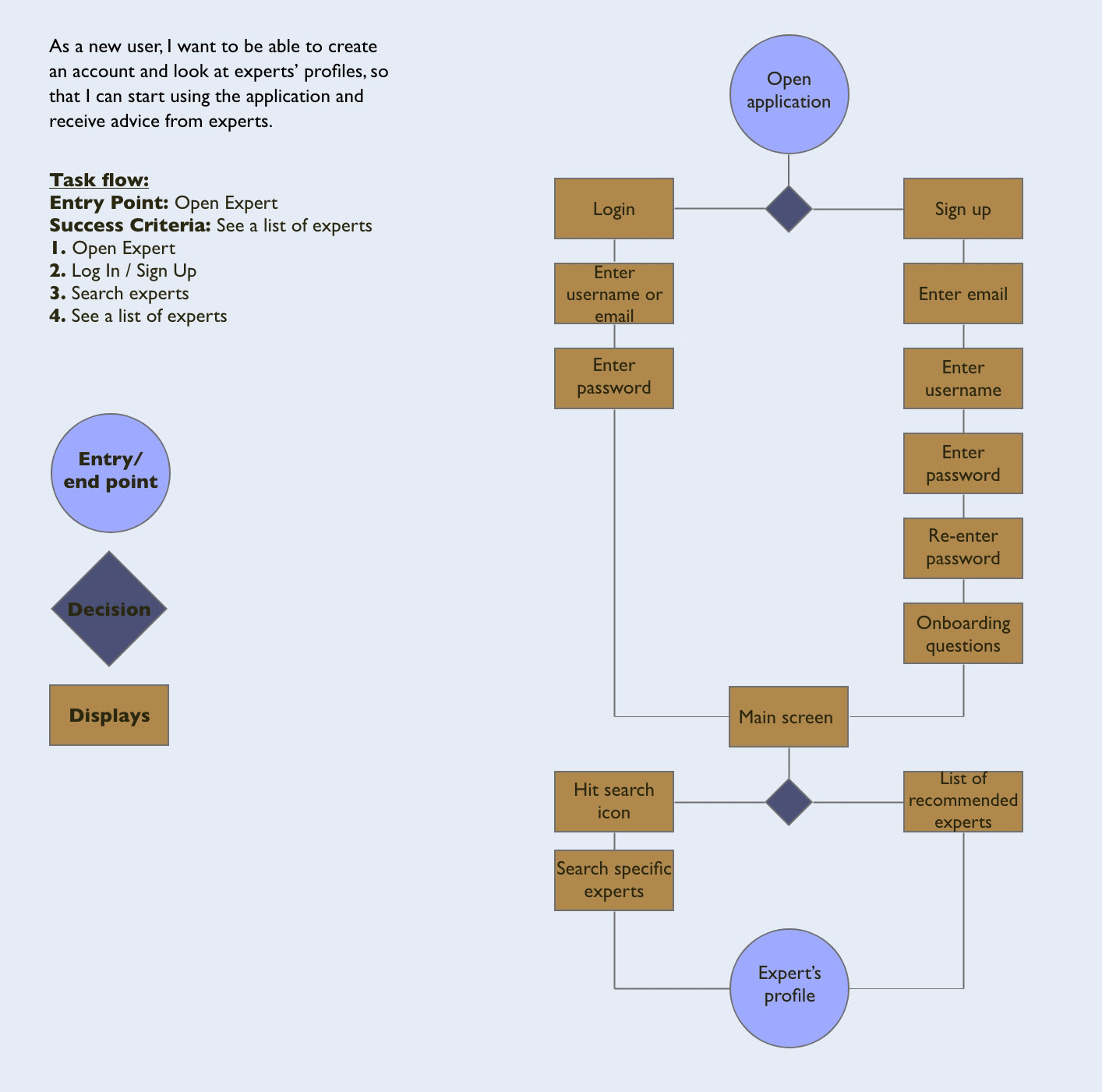
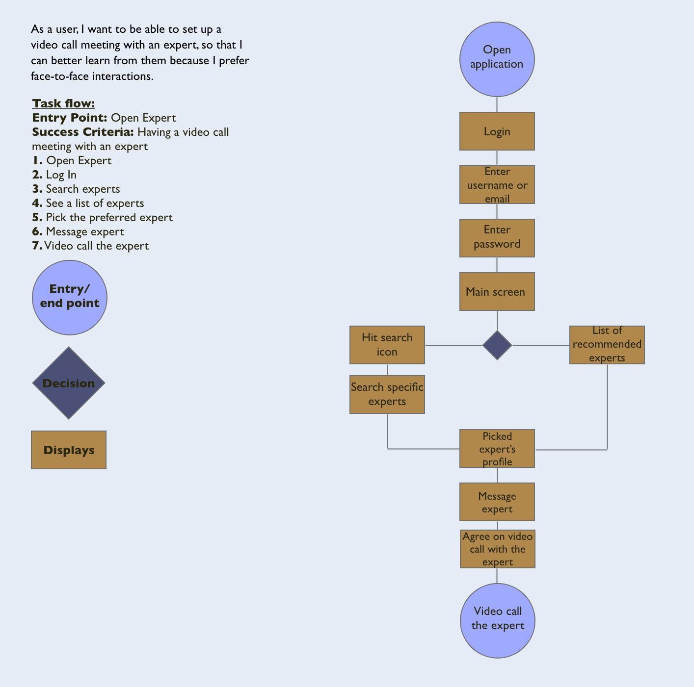
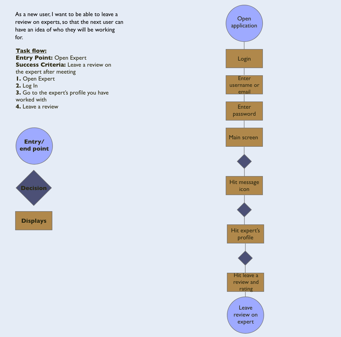
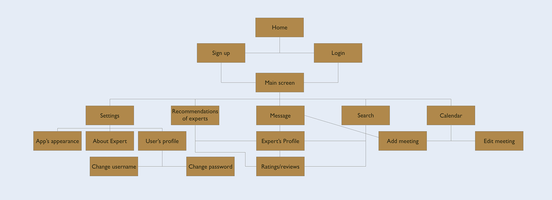
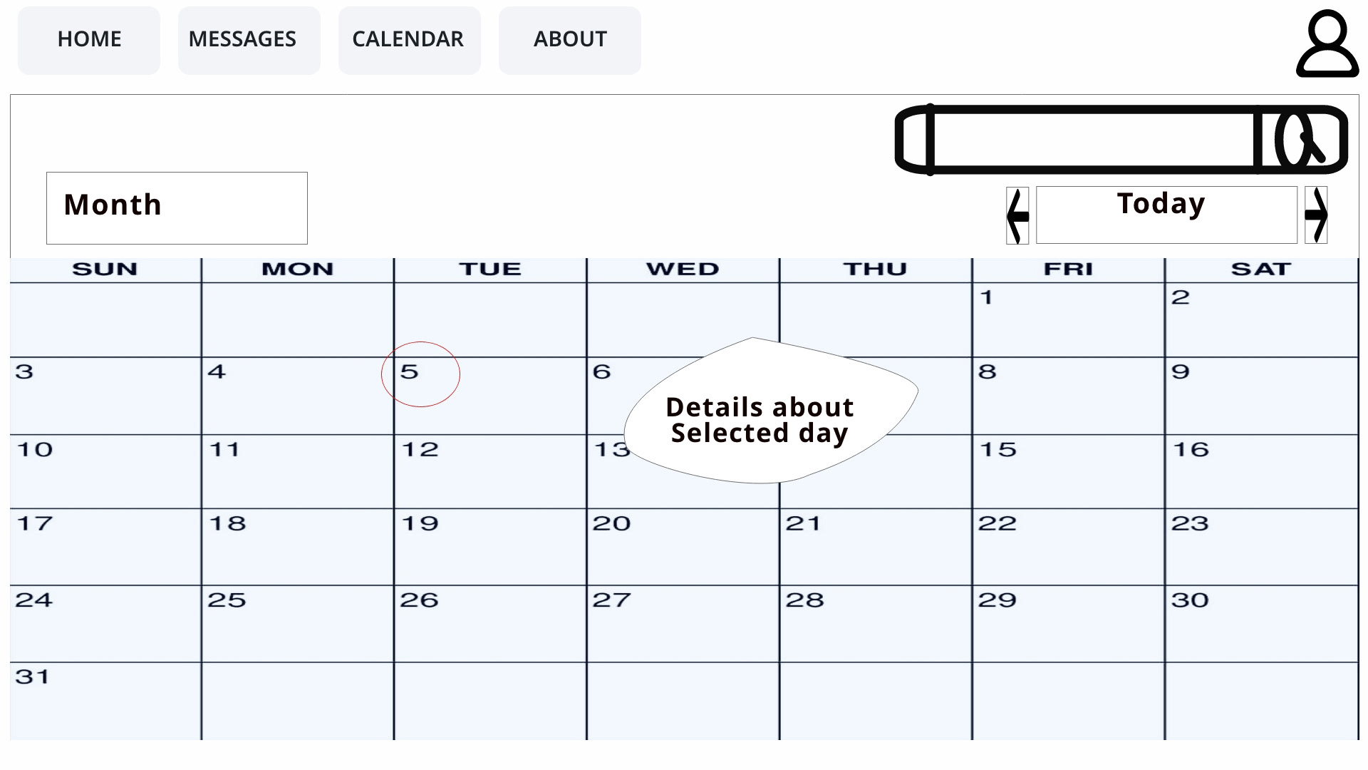
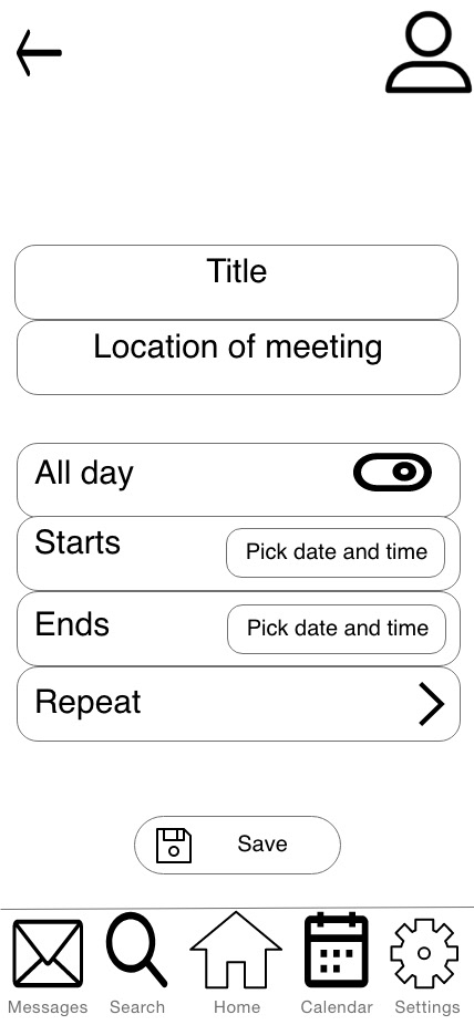
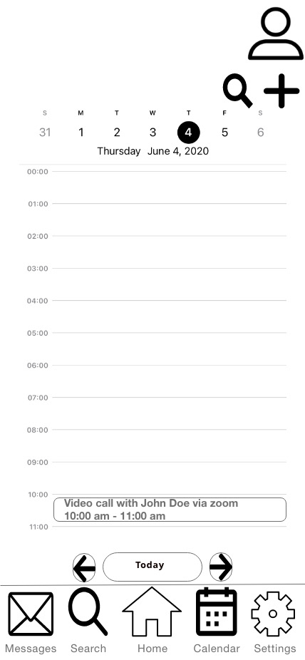
USER FLOW AND SITEMAP
User flows were created to display steps the personas will take to complete various goals within the Expert app. A sitemap was also made to show the core values of the Expert app.
PROTOTYPING
LOW-FIDELITY PROTOTYPE
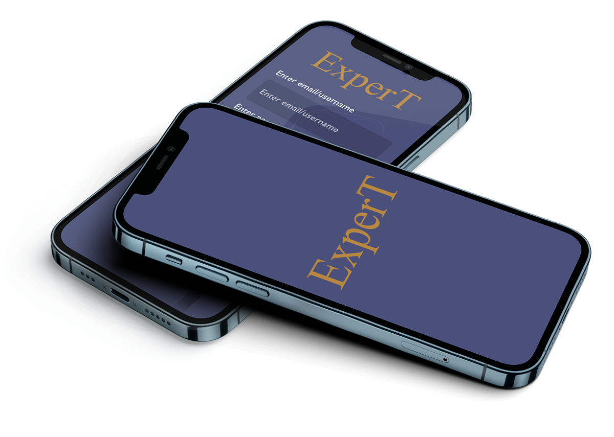
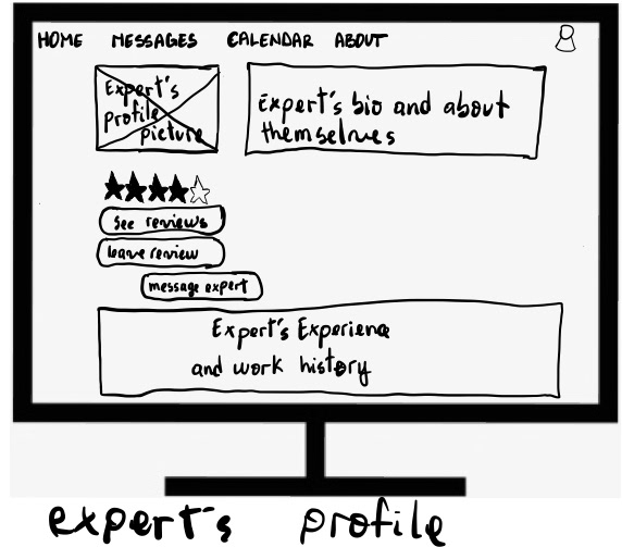
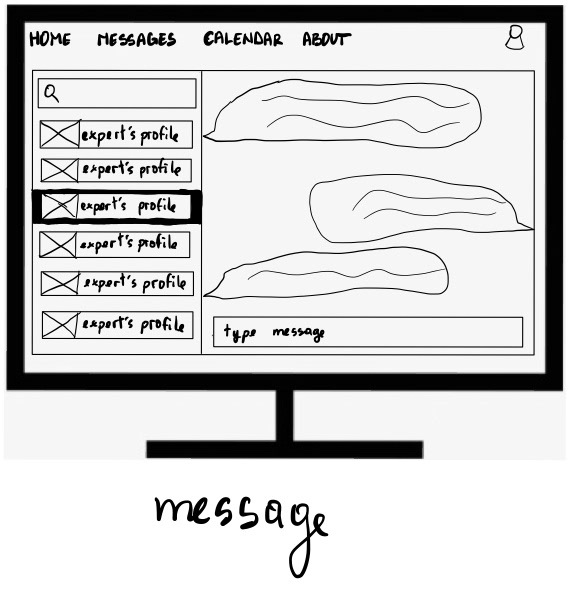
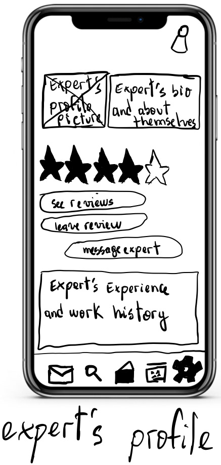
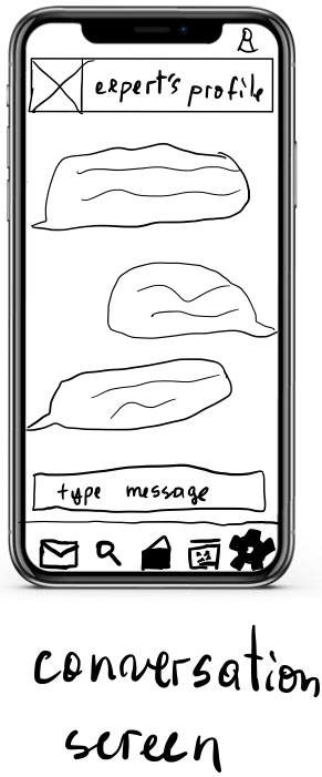
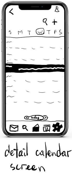
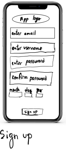
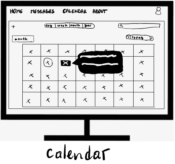
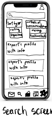
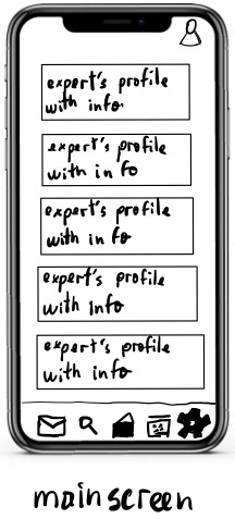
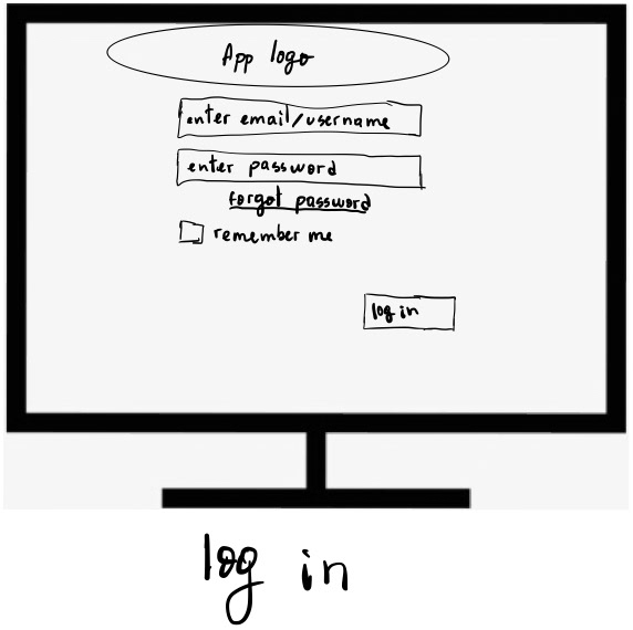
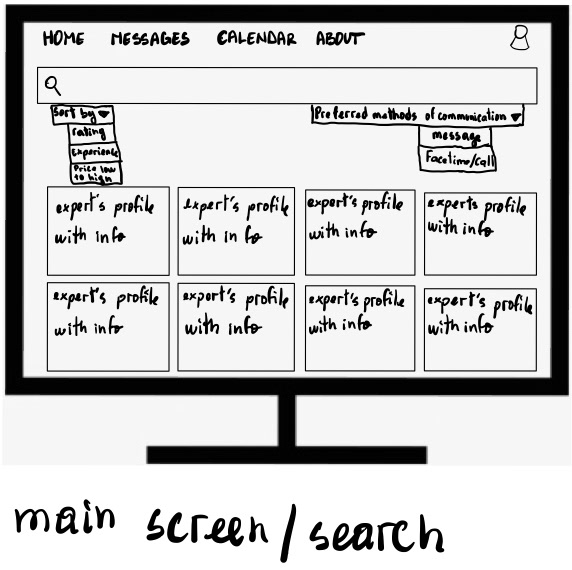
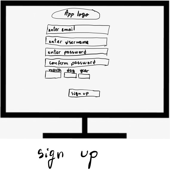
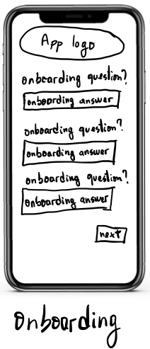
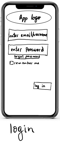
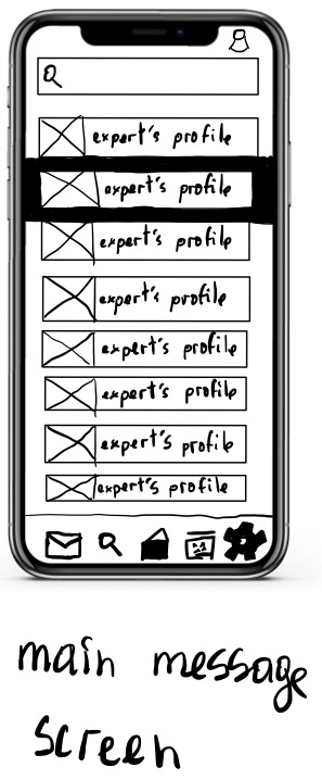
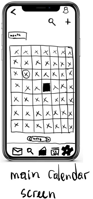
When starting the prototyping phase, I started with a low-fidelity prototype. The low-fidelity prototype was made only to display the high-level functionality of the Expert app while paying little attention to the fine details. The low-fidelity prototype was hand drawn in an empty iPhone shell for the mobile version and a computer monitor for the desktop version.
MID-FIDELITY PROTOTYPE
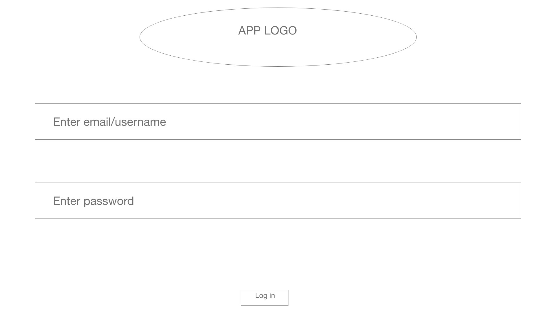
After laying the essential foundations for the Expert app, I created a mid-fidelity prototype for mobile and desktop versions. It was made rapidly using Adobe XD, and its goal was to be a bit more detailed than the low-fidelity prototype and look more similar to the final product. A moderated test was conducted to understand how users would interact with the Expert application and get their feedback that would help the Expert app be an application that meets the needs and goals of the users.


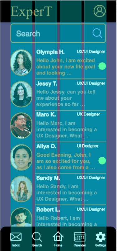
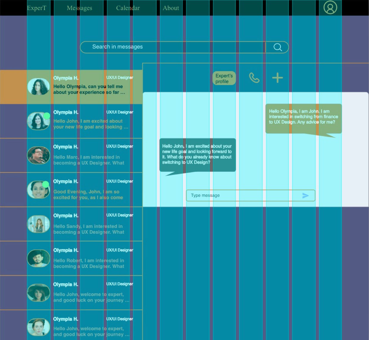
HIGH-FIDELITY PROTOTYPE
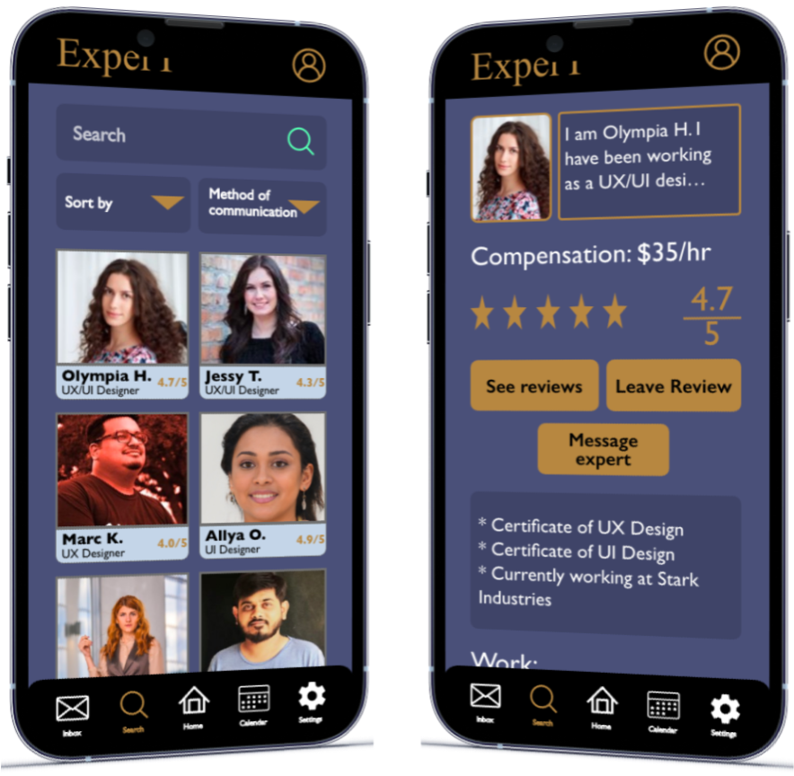
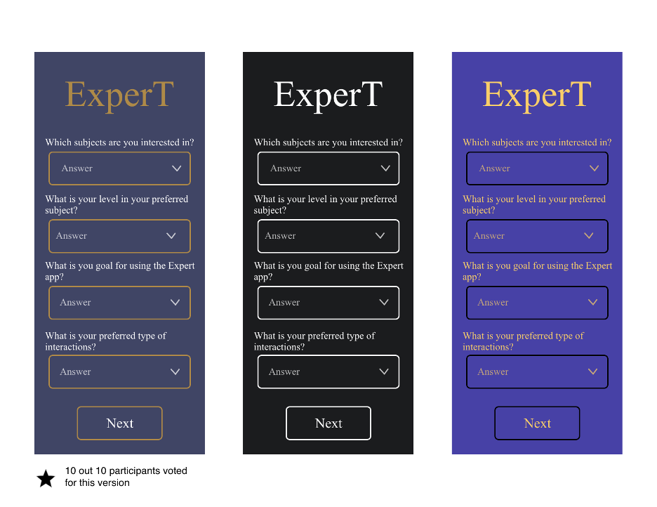
Then after the mid-fidelity prototype, I created a hi-fidelity prototype. The high-fidelity prototype was a final-looking and polished version of the Expert app. The first step I took in making the high-fidelity prototype was to do a preference test. I designed three screens with different color schemes and then had 10 participants pick their favorite color scheme. 10 out of 10 participants chose the first color option.
I used the grid option in Adobe XD to help me align the texts, images, and logos on the screens. Using the grid helped all the screens stay consistent throughout the application. The grid measurements for the mobile were 4 columns, 10 px gutters, and 37 px margins. The grid measurements for the desktop were 12 columns, 16 px gutters, and 140 px margins.
DESIGN
Modifications were made to the application after taking into account the feedback from the users.
CONCLUSION
My main problems were to create trust between the experts and the users, help the users find experts easily, and make sure that the experts work with the level of the users in mind.
I was able to create trust between the experts and the users by having the users rate the experts after working together and having them showcase their work and credentials. Users will be able to find experts more accessible by the application matching them experts based on their answers in the onboarding process and who they have worked with before. The onboarding process also helps the experts determine the level of the users, therefore, tailoring their advice. So the final product is as I envisioned when I first encountered the problem.
The most challenging part was choosing which interface would be better for the application. Ultimately, I decided to go with one where everything would be simple. The final version would be the best for the users because the users most likely want to log into the application, get advice, and apply that advice. So I did not want to clutter them with too much unnecessary information.
From now on, I would like to interview more participants to have more diverse answers, which would help me create a more user-centric design.